Graphic Designers Don’t Share These Canva Secrets (Until Now)
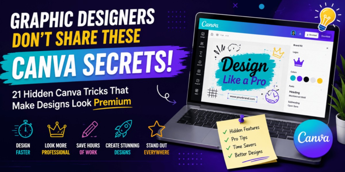
21 Hidden Canva Tricks That Make Designs Look Premium Graphic Designers Don’t Share These Canva Secrets Think Canva is just drag-and-drop? Discover 21 hidden Canva secrets professional graphic designers use to create stunning designs faster. Learn time-saving tricks, advanced features, and creative workflows that most beginners never discover. What if I told you… Two people can use the same Canva template… The same fonts… The same images… And yet one design looks ordinary, while the other looks like it was created by a professional designer. The difference isn’t luck. It isn’t years of experience. It’s knowing a few hidden Canva techniques that most people never use. Today, you’re about to discover those secrets. Quick Answer Professional-looking Canva designs don’t come from expensive templates—they come from smart workflows. Hidden features like Layers, Brand Kits, Magic Resize, Background Remover, Styles, Frames, Mockups, Alignment tools, Transparency, and Keyboard Shortcuts help designers work faster while producing cleaner, more polished designs. Table of Content Introduction Millions of people use Canva every day. But only a small percentage create designs that instantly grab attention. Why? Because most users only know about templates, text, and elements. Professional designers know Canva has dozens of hidden features that save time, improve consistency, and make every design feel premium. Let’s uncover them. Story A small business owner wanted Instagram posts that looked professional. She spent over two hours creating one post. Even after all that effort… The design still looked average. A designer opened the same Canva file. Within 20 minutes, they: • Improved alignment• Fixed spacing• Used hidden keyboard shortcuts• Applied a color style consistently• Added subtle shadows and transparency• Organized layers The final design looked like it came from a creative agency. The difference wasn’t talent alone—it was knowing Canva’s hidden features. Problem Most Canva users: ❌ Add too many fonts. ❌ Use random colors. ❌ Ignore spacing. ❌ Don’t organize layers. ❌ Never use Canva’s advanced tools. As a result, their designs look cluttered instead of professional. Statistics • Canva is used by millions of creators worldwide. • Visual content consistently attracts more engagement than text-only content. • Consistent branding helps businesses become more recognizable. The best-performing designs are usually simple, consistent, and easy to understand. Step-by-Step Guide Secret #1 — Use Layers Arrange elements precisely. Bring objects forward. Send them backward. Lock backgrounds before editing. Secret #2 — Position Tool Instead of dragging manually… Use Position to perfectly align every object. Professional designs rely on clean alignment. Secret #3 — Tidy Up Select multiple elements. Click Tidy Up. Canva automatically spaces everything evenly. Secret #4 — Lock Elements Finished with a logo? Lock it. Now you won’t accidentally move it. Secret #5 — Group Elements Select multiple objects. Press Ctrl + G. Move everything together. Huge time saver. Secret #6 — Duplicate Pages Instead of creating every design from scratch… Duplicate pages. Change only: • Text • Images • Colors Perfect for Instagram carousels. Secret #7 — Styles Apply an entirely new color palette and font combination with one click. This instantly refreshes an old design. Secret #8 — Brand Kit Store: ✔ Brand colors ✔ Logos ✔ Fonts ✔ Brand assets Maintain consistency across every design. Secret #9 — Magic Resize Need one design for: Instagram Facebook LinkedIn Pinterest Use Magic Resize instead of recreating everything manually. Secret #10 — Background Remover Remove image backgrounds in seconds for cleaner compositions. Secret #11 — Frames Drop photos into creative shapes without complex editing. Perfect for modern layouts. Secret #12 — Mockups Show your design on: Laptop screens Phones Billboards T-shirts Packaging This makes client presentations much more impressive. Secret #13 — Transparency Lower opacity to create subtle overlays, soft backgrounds, and depth. Secret #14 — Shadows Small shadows make text and images easier to read while adding dimension. Secret #15 — Smart Guides Pink guide lines help align everything perfectly. Don’t ignore them. Secret #16 — Keyboard Shortcuts Duplicate: Ctrl + D Group: Ctrl + G Undo: Ctrl + Z These shortcuts save countless clicks. Secret #17 — Canva Draw Use drawing tools to highlight important points or add a handwritten feel. Secret #18 — Elements Search Search smarter using terms like: Gradient Blob Minimal Glass Duotone Shadow You’ll discover hidden assets most users never find. Secret #19 — Text Effects Use: Curve Lift Splice Shadow Outline Sparingly for eye-catching headlines. Secret #20 — White Space Not every area needs decoration. Empty space makes designs easier to read and feel more premium. Secret #21 — Save Your Best Templates Create reusable templates for social posts, presentations, and marketing materials to speed up future projects. Examples Beginner Design Professional Canva Design Five fonts Two fonts Bright random colors Consistent colors Uneven spacing Balanced spacing Disorder Clear structure Crowded layout Plenty of white space Visuals Include: • Canva Layers Illustration • Before vs After Design • Alignment Guide • Typography Comparison • Color Palette Example • White Space Demonstration • Brand Kit Screenshot • Canva Workflow Diagram Case Study A freelance designer spent nearly three hours creating each social media post. After learning Canva’s hidden tools: • Templates replaced repetitive work. • Brand Kit ensured consistent branding. • Magic Resize adapted designs for multiple platforms. • Position and Tidy Up improved layout quality. The designer produced more content in less time while maintaining a professional look. Canva Features Worth Mastering ✔ Brand Kit ✔ Magic Resize ✔ Background Remover ✔ Mockups ✔ Frames ✔ Layers ✔ Styles ✔ Position Tool ✔ Transparency ✔ Text Effects ✔ Smart Guides ✔ Keyboard Shortcuts Common Canva Mistakes ❌ Using too many fonts ❌ Overusing animations ❌ Ignoring spacing ❌ Stretching images ❌ Using low-quality photos ❌ Filling every empty space ❌ Inconsistent colors ❌ Misaligned elements Expert Tips ✔ Follow the “less is more” principle. ✔ Keep a consistent color palette. ✔ Limit yourself to two fonts. ✔ Use templates as a starting point, not a finished design. ✔ Zoom in before exporting to catch alignment issues. ✔ Build your … Read more